


Baking Company Brand
A baking company brand identity design featuring products, merchandise, and
other items.
other items.
Have you ever traveled somewhere and had the best food you can remember? How much of that was the food, and how much as the experience? This project focuses on a brand identity that can created an experience covering a wide range of purposes.


These are different logo styles. Although similar and consistent these are created for a base line between different designers. Depending on the space will depend on the logo used, which can be seen throughout this project.
I started out this project with a lot of research on the area and culture. Karioi Baking Company is based in New Zealand close to a surfing community. Some background history is that during colonization the Maori culture nearly died out since it became illegal to practice it. Maori heritage almost died out, until recent years where they have made it a goal to reintegrate it into the community. The native language is now taught in most schools, and there is a flourish of this tribal culture. With this in mind I wanted to expand on it the most I could.
Some things I did to integrate this into the brand can be seen in a few ways. As I said before Karioi is located near a surfing community, the arch found in the 'k,' 'r,' and two in the 'o' are a symbol of the wave. A long time ago, the Moari people were cannibals, and would make an intimating face where they would bulge their eyes and stick out their tongue which in turn meant that they were going to 'eat you.' Although this is not in practice today, I wanted to bring in the idea of wanting to 'eat tasty' treats for a
baking company.
baking company.

Tane Mahana is not a real person, rather accumulative information about the locals in the area to create a single ideal client.
As the brand identify began to develop I found it extremely important to create a persona. Personas are nearly as fundamental as the logo. Have you ever heard the phrase 'if you make it, people will come?' Although true in some cases, this isn't always the best way to go about it. Creating a persona that makes an ideal client allows for a targeted audience and consistency in where a company wants to go.

There are a wide number of flours to select from when shopping for flour. For the Karioi Baking Company, it would be split into three different types. Yellow for unbleached, blue for regular, and green for organic. Within each type the styles can be altered in the subtitle.
After creating a strong base, I moved onto products that this company could potentially sale. Flour proved to be quite the challenge. If you have ever purchased flour, you'll see that there are a wide variety of types and styles of flour. I wanted to create consistency between the different types of flour by keeping consistent layouts. This would be recognizable on a shelf with other brands of flour, but there also needs to be differences within the brand to show the different types and styles of flour. In doing so I found there are three major categories in flour; regular, unbleached, and organic. By splitting these three up into yellow, blue, and green, it creates enough of a difference to be identifiable by the average person. However, for those that are color blind the hues are different enough to tell apart in addition to the pattern slightly changing between each look. If these types of flour were to be expanded simply the subtitle, found just right of the logo, can be changed for the different styles of flour. This creates an easily consistent but expandable
flour design.
flour design.

Tote bags are becoming more and more common; whether in New Zealand or across the globe. Would use use a bag like this?
The question began to arise if Karioi Baking Company were to expand beyond just baking products. During the time of research I found the residents of New Zealand do not have plastic bags, rather get reusable ones to help with pollution. If a customer were to come in and make a purchase, not having any bags, a tote bag would be very effective. Although similar to the flour bags, the logo is made a lot smaller and placed in the bottom right hand corner. It still has a presence on the bag, but by highlighting the design the user is more likely to use it without the pressure of advertising the company.

The logo can be seen in the bottom right hand corner. As well, the character faces are very prominent and help with creating a subconscious impression without pushing a company.
Looking back at the persona for the Karioi Baking Company as well as some geographical research I found that there is lots of green space and beach that are commonly used by the locals. A picnic blanket is a great way to allow for customers to use it day to day and be able to remember the brand. Merchandise for any company can act for advertising, but it is still important to create something beautiful for the every day user. This may see further from the baking part of the brand, in turn creating a longer lasting experience
in exchange.
in exchange.
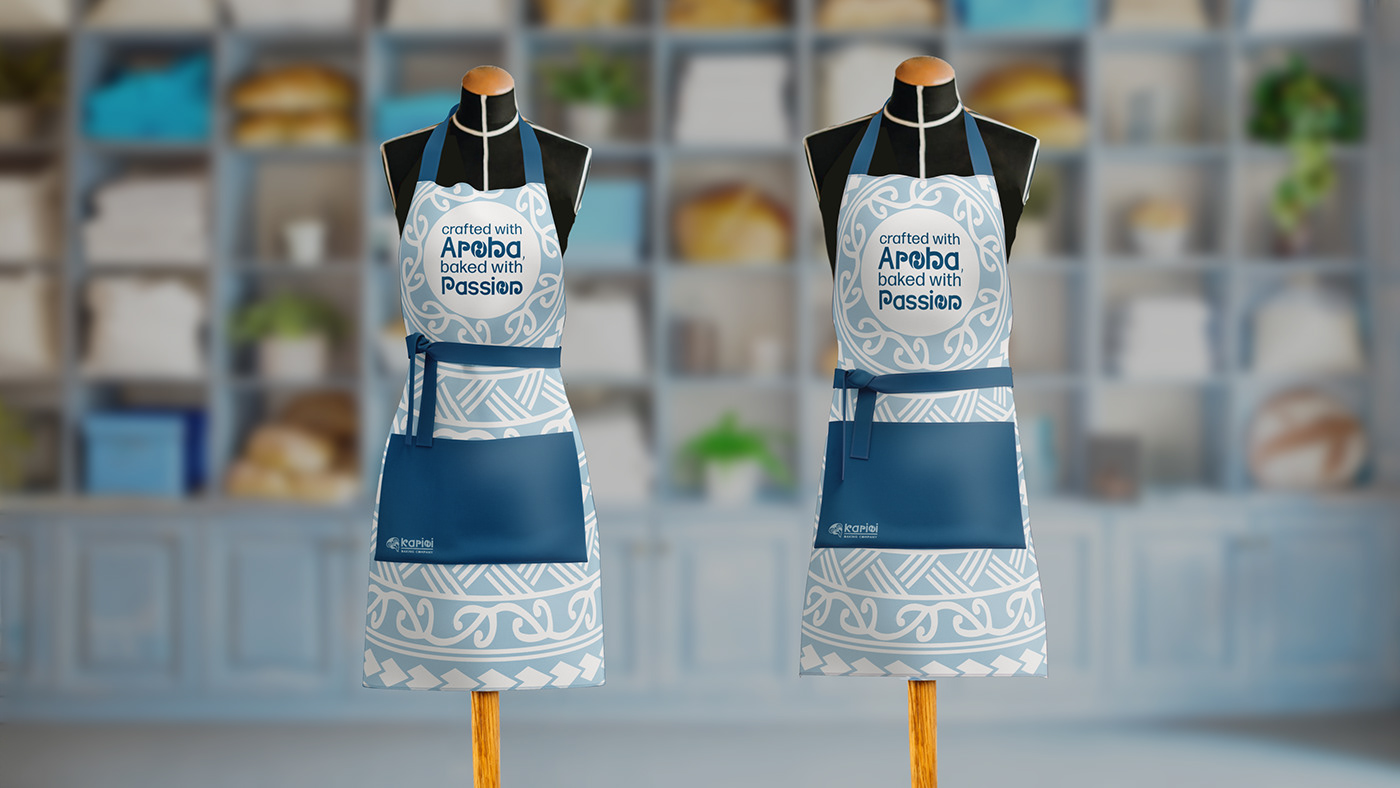
On the chest piece of these aprons it reads, 'crafted with aroha, baked with passion.' Aroha translates from Maori to mean love in English. Which then reads, 'crafted with love, baked with passion.'
The third piece of merchandise I wanted to offer would be aprons. With selling flour and other baking supplies this would be a very functional purchase. This also enables the ability to highlight the brands catch phrase, 'crafted with aroha, baked with passion.' This further emphasizes the family friendly appeal of Karioi Baking Company. Keeping the design consistent as well as utalizing the typography of the logo helps draw in the brand.


the first image shows what a customer sees when they are first handed the menu. If the customer takes the bottom right hand corner and folds the page out it reveals the menu, looking like the second image. As the customer continues and grabs the left hand bottom corner of the right hand panel and folds it out it would reveal the third image. If the page were to be flipped over it would look similar to the fourth and final image.
So far this project has focused on what a customer could purchase and leave the store with. What about the experience inside the store, where they simply leave with a satisfied stomach and pleasant experience? This then brings into play the importance of a menu. I wanted to create something functional and beautiful. After some consideration I landed on using the tri-fold layout. This layout encourages customers to pick up, interact with, and use the menu. To be able to see the information on the inside, customers much pick up and unfold to see what treats lie ahead.

Although simple in design, function is key. Things like the balance due are emphasized in the bottom right corner in dark blue. Each piece of information is organized with consistency. Even the colored lines in the chart are placed for a reason. The blue lines help the reader make sure they are on the same line as they read across each line.
Although the customer sees most of the designs and work put into a brand, there are still some key background things. For example an invoice which is featured above. Invoices are used to help a company keep track of purchases and orders. I wanted to focus more on the functional and professional use of this invoice. The Maori character is not featured in this design, rather it focuses on the information the company needs(invoice number, prices, items, etc.). Some small details you may notice are the numbers, which appear all right aligned. This is to make all the decimal points aligned for easer reading.

With everything put together and a brand identity outlined Karioi Baking Company would be on the start of becoming real. Would you want to shop here?


